Sour Pearl

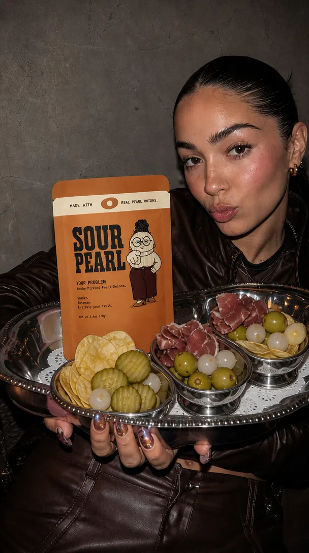
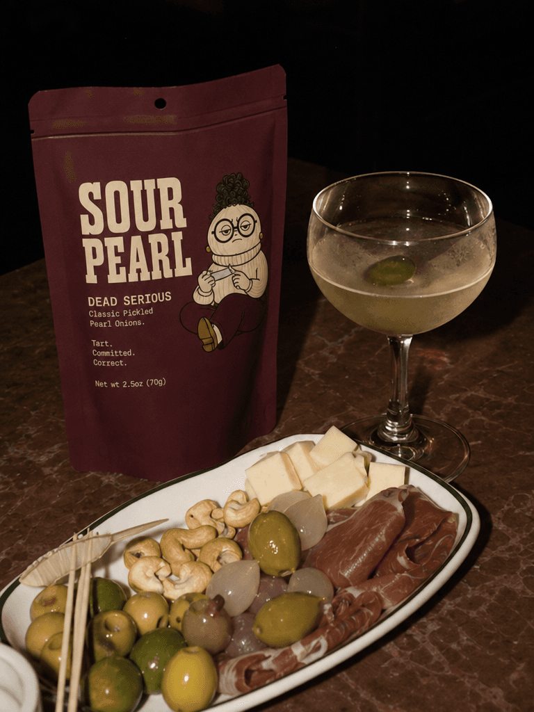
Sour Pearl is a premium pickled pearl onion brand built around a single idea: the most overlooked thing on the table deserves the loudest identity. We handled the full creative scope — brand name, identity, mascot character design, three-SKU packaging system, and campaign art direction. The design language is built on hand-drawn illustration and a warm, personality-led typographic system that sits completely apart from the clean minimalism that dominates the specialty food space. The brand mascot VERA is the product made visible — small, round, completely unbothered, and utterly convinced of her own importance.